I led the re-design of Bezeq’s alarm alert platform, enhancing real-time monitoring and notifications for end devices, sensors, and critical infrastructure across Israel. The new system efficiently covers military installations and essential communication networks, such as internet and telephone services.
Argus
Context
The problem
The existing alarm alert platform developed nine years ago, had become outdated, cumbersome, and challenging for novice users to navigate. Its antiquated design and lack of user-friendly features hindered efficient operation and accessibility.
Project Objectives
- Modernize the Interface: Refresh the platform with a modern design.
- Clarify Alarm Prioritization: Improve visual indicators
- Reduce complexity to ensure a low learning curve for all users.
- Enhance Customization: Enable full customization
- Boost Efficiency: Optimize functionality for faster decision-making and increased operational efficiency.
Impact & Results
- Reduced user errors from 20 errors per 100 interactions to 14 errors per 100 interactions, a 30% decrease, due to simplified clearer prioritization.
- 92% of users are actively utilizing the new customization features for tables and filters, demonstrating enhanced user engagement and platform flexibility.
- 96% improvement in user satisfaction, especially with usability and dark mode.
- 42% decrease in user errors due to simplified navigation and clearer prioritization.
Research
On-Site Visit
To understand the challenges and needs of our users, We conducted on-site visits to observe their workflows and interactions with the existing alarm alert platform. These visits provided valuable insights into the daily operations and pain points experienced by users.
By immersing ourselves in their work environment, We were able to:
- Identify specific usability issues and inefficiencies in the current system.
- Gather direct feedback on what users found cumbersome or confusing.
- Observe the context in which the platform is used, including environmental factors and user behaviors.
- Understand the diverse needs of both novice and experienced users.
User interviews
Following on-site observations, we interviewed users to identify challenges, understand workflows, and gather crucial feedback on usability. These insights are guiding the platform redesign for improved usability and operational efficiency.


Users survey
Following on-site observations, we interviewed users to identify challenges, understand workflows, and gather crucial feedback on usability. These insights are guiding the platform redesign for improved usability and operational efficiency.
Survey’s results
- 78% Reported challenges with navigation and accessing information quickly
- 65% Found the alarm prioritization confusing
- 53% Faced difficulties in efficiently accessing real-time data

View detailed results here
Navigation and Information Access
1.”Finding relevant information quickly is a challenge.” (15 users)
2. “The navigation is not intuitive.” (10 users)
3. “Accessing real-time data requires too many steps.” (5 users)
4. “I appreciate the comprehensive information available once found.” (6 users)
5. “The overall layout is good, but some areas are confusing.” (4 users)
Alarm Prioritization and Understanding
6. “Understanding the criteria for alarm prioritization is difficult.” (12 users)
7. “The alarm categorization is confusing.” (8 users)
8. “Clearer indicators for alarm priorities would help.” (10 users)
9. “The detailed alarm information provided is helpful.” (6 users)
10. “The prioritization is helpful once understood.” (4 users)
Usability and Efficiency Enhancements
11. “I need a more streamlined workflow.” (10 users)
12. “The component designs are too complex; simpler designs would be better.” (12 users)
13. “Dynamic event map view and Better Rules managements .” (8 users)
14. “I appreciate the existing efficiency of certain features.” (6 users)
15. “The platform is generally user-friendly but needs minor tweaks.” (2 users)
Insight #1
Eliminating Dead-End Flows
The old platform was structured with dead-end flows, forcing users to search for information across multiple screens. To address this, the new platform aims to provide a seamless cross-screen flow, allowing users to access information quickly and intuitively without unnecessary navigation.

Insight #2
Simplifying Complex Components
Users found many components of the current platform too complex to understand. In The new design, we aim to simplify these components, ensuring that users can easily comprehend and interact with all features, enhancing overall usability and efficiency.

Ideation
Transforming Insights into User-Centric Design Solutions
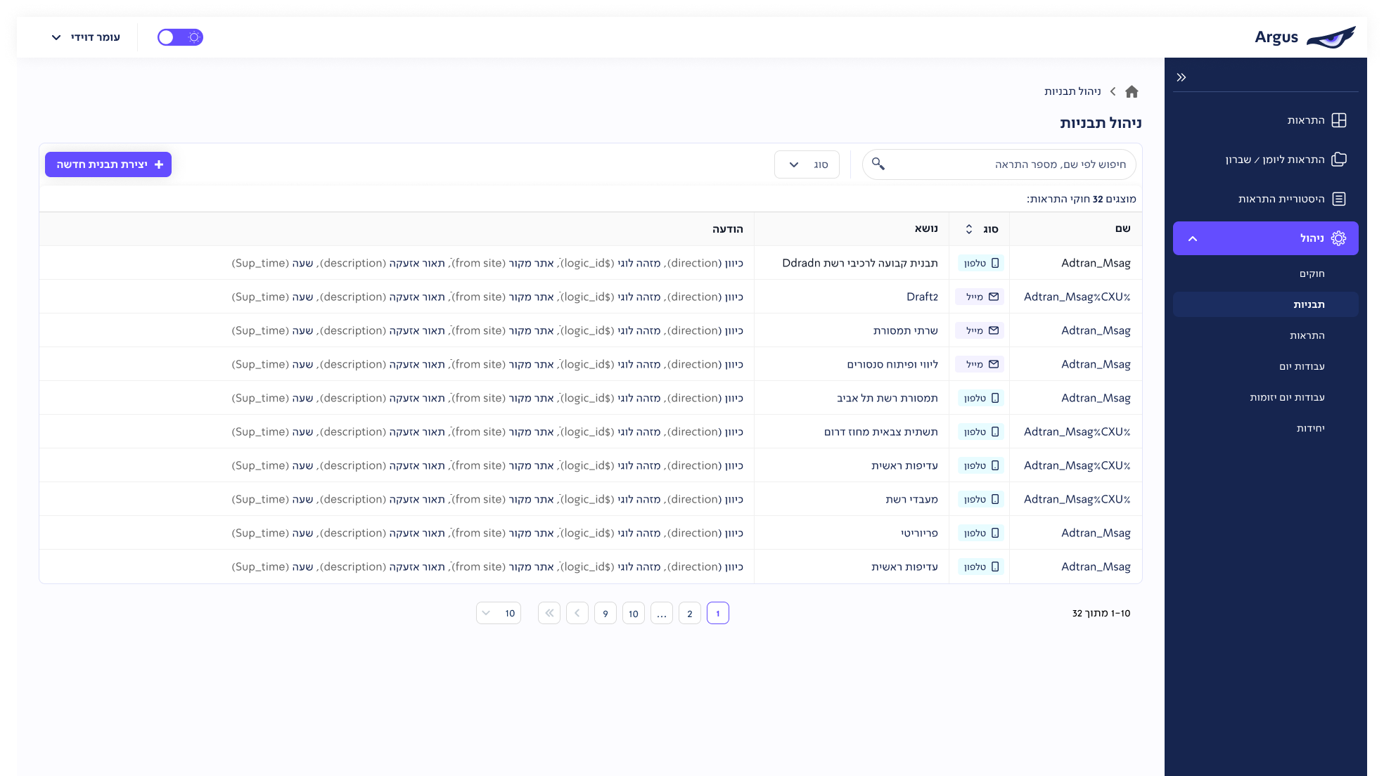
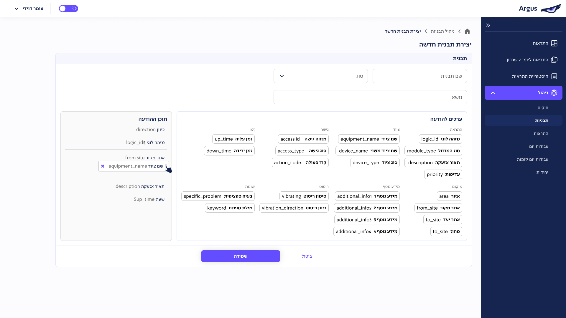
The ideation phase was crucial in turning user research insights into actionable design solutions. We began by sketching ideas and creating low-fidelity wireframes, mapping out all functions and components to ensure seamless cross-screen navigation. We chose to retain the existing alarm table view as the foundation, building and refining the rest of the platform around this core element.


Solution
Crafting an Intuitive Interface
After the initial specification process using low-fidelity designs, we finalized a solution with users that meets their needs, incorporating a table view similar to the old system but with full customization options for fields and filters. Given the dark environment of the workspace, we also decided to implement a dark mode to reduce screen glare and improve visibility.
We maintained a structure similar to the old system to ensure a low learning curve for users.The main components we addressed included:
- Adding a priority label with traffic light colors for clearer priority classification.
- Separating filters into system filters (fixed) and user-created, editable private filters.
- Enabling full customization of the table columns.


